BUILD
Kry Pro:
Rethinking clinician tools in primary care.
SKILLS
Interaction design, user research, visual design
ROLE
Lead designer
COLLAB
Product managers, fellow designers, design system experts, content writer
Background
CONTEXT
Kry/Livi is redefining patient-centered primary care with the help of technology in the largest countries in Europe. The team’s mission is to blend digital and traditional care to help more people get the care they need. My mandate is to create a software suite that empowers our clinicians (general practitioners, nurses and clinic staff) to deliver care in a variety of ways such as chat, video, in-person consultations, asynchronous messaging, or continuous care.
DESIGN PROBLEMS TO SOLVE
At Kry Design we believe in the differentiating value of patient-centered care experiences. Primary care is ultimately about communicating with and navigating patients on their care journey. As Kry was experimenting with new care types, communication channels, and preventive services, we grew out of our own software: new functionality could not be built without breaking established design patterns and compromising on our users’ efficiency.
Professional healthcare software is often full of design choices based on compromises. Clinicians are required to go through a steep learning curve to build confidence: efficiency with complex, data-heavy tools comes only with training and workarounds. We questioned whether this was unavoidable, especially when a clinician’s time well spent with patients is in such high demand.

Care Portal, Kry's clinician tool before we began the redesign.
Our challenge was to define new design patterns that could help a complex product scale to serve a technology-enabled healthcare service, while making it simple and delightful for clinicians to use.
Design approach
MOVING AWAY FROM PERMANENCE
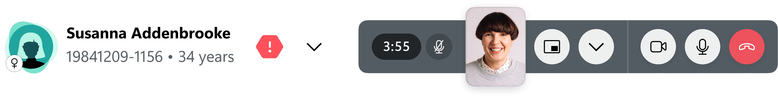
We built a dynamic interface with a layout that responds to user action. This is achieved with intuitive controls and a responsive use of space. The page only shows what is essential, while keeping peripheral content quick to access. At first, the video takes up ample space to help establish eye contact between patient and clinician, then gets reduced when clinicians start their administrative work.
VISUAL ORDER
We applied a strict visual hierarchy that followed the sequence in which clinicians looked for information about their patients’ health status. To do this, we needed to learn what was important and when during patient consultations.
Key interface elements, organized in the sequence of how healthcare professionals consume information and take actions.
FORM FOLLOWS CONTENT
To improve wayfinding across the patient page, we applied a new information architecture and reorganized an ever growing set of patient data.
Samples of reorganized content across the patient record.
COMMON VS. UNIQUE
There are no two identical patient consultations. Our goal was to build one product that can work across professions and countries. I observed countless consultations and clinicians doing admin work to find commonalities.
Task flow during a nurse's digital consultation.
Without limiting our users’ freedom, the interface reinforces commonly performed actions, while keeping less frequently used tools at hand.

LEARNABLE & CONVENIENT INTERACTIONS
We designed interactions for learnability and convenience, and consciously moved closer towards a contemporary digital experience. This proved difficult at first because our clinicians often expected outdated patterns, such as windows popping open, as established by other electronic medical record systems.
Results
PRODUCT IMPACT
These designs are under development. This is the impact we expect once it goes live.
Satisfaction
Product satisfaction of our clinicians increases by 10%.
Efficiency
Clinician efficiency remaining high: clinicians can consult as many patients per hour as before.
Scalability
Features following the redesign have a considerably shorter time-to-market.
THE WAY FORWARD
We explored several variations of the design language. Serving our clinicians with a best-in-class user experience means moving closer to an easily learnable interface, just like SaaS tools. It remains a challenge to represent the brand in a clinically acceptable way, and supporting the exceptional efficiency required for clinical care.
The evolution of design patterns while exploring the visual language.
REFLECTIONS
The backbone of the process was following design heuristics and iteratively testing concepts. The difference in the experience, however, became tangible after just a few drafts. The challenge was to keep staying true to those principles even when regulatory or technical constraints reduced the room for creative freedom.
Another challenge was that the redesign was met with change aversion by our users. To turn the corner, we have been inviting our power users to provide feedback in each iteration from low-fidelity prototypes all the way until after beta launch. We addressed unmet needs without giving up on the essence of the newly established interface structure and design patterns.
It took more than a single designer to make this happen. VALENTYN MYTCHYK owned our Design System. TEDDY DERKERT designed the communication tools. ALICE WILLIAMS designed the content and wrote UX copy. DANIEL ANUNDI designed the patient card and advocated for our Swedish users.